Colours, shapes & materials
In an interior – and, come to think of it, a bit like everywhere else – everything is a matter of balance and harmony. Imagine yourself in a space made of a single material. After a while, from living there, you grow tired of it, you feel stifled, you no longer feel quite right there. And rightly so, because every material gives off a certain radiance.
Materials, light and shapes form a space quite apart from the objects that occupy it. To this we add colour. So yes, then come smells, sounds, everything that awakens our senses, but let’s focus on the material aspect for now.
A well-proportioned flat with a beautiful old parquet floor, lovely light through a wide picture window, a beautiful wall in a light colour: you feel good there straight away, you want to picture yourself there, to spend time there. We flee cramped, angular, dark and dull spaces.
It is important to balance materials. Fabrics, wood, stone, glass, metal,.. pay attention to what is present in your space. Every material gives off a certain energy. Even if you are a fan of the total look (rattan, for example), you will counterbalance it with fabric, a rug or a glass table, for instance. I don’t like to talk about rules but rather about common sense – but of course always pay close attention to your first impression. Since your space is directly connected to you, it is natural for a more reserved person to favour wood and soft colours, whereas someone with a stronger temperament will more readily embrace a red wall or a stone table. Once again, there is no norm: follow your wishes and choose elements that stir something in you.
I would like to draw your attention to one tool – the colour wheel – and to observe complementary colours:
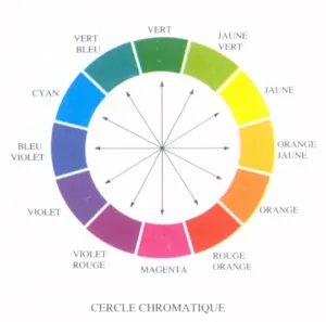
We will talk about hue, lightness and saturation.
-Hue = the nature of the colour: yellow, green, blue,..
-Lightness = indicates whether the colour is light or dark
-Saturation = indicates whether the colour is vivid or dull
Apart from tone on tone (a lighter green with a darker green), complementary colours are generally used to pair colours. Complementary colours are colours whose hues sit opposite each other on the colour wheel.
The 4 base colours that make up all the others are cyan, magenta, yellow and black (CMYK). From these colours we create the rest, i.e. all those that lie in between: we mix cyan and magenta to make mauve, magenta with yellow to make orange, yellow with cyan to make green.
Dare to use colour!
At first, if you are not very confident with colours, it is advisable to use complementary colours to help you find combinations, if you don’t want to limit yourself to tone on tone.
For example: a pink with a green – an orange with a sky blue,..
Once you have chosen the hue, you will play with lightness and saturation.
The pink becomes pastel and the green pistachio (light but less saturated colours), or a zingy orange (saturated and light) with a sky blue (light and saturated too). A light colour can look entirely dull to the eye: take beige or taupe, for example!
People often think you have to use white to brighten a room, but there are so many colours that can bring light – it all depends on their saturation and lightness.
Did you enjoy this article?
Feel free to leave your thoughts in the comments and to subscribe for more articles ☺